
Website contents
Summary The toll of deaths and other consequences Deaths per day New cases per day UK "Global Death Comparison" chart UK nation and regional comparisons Poor UK Government decision making NHS/PHE labs are being denied testing reagents Unspecified case location in 70% of UK cases Problems with the covid-19 science Problems with the media and covid-19 Reasons to be concerned Reporting delays in Liverpool for covid-19 tests Action needed Elimination of the virus ("Zero covid") Elimination successes Population ("herd") immunity Countries with the best covid-19 control: half-lives of 5 days When to end the UK lockdown Predicting epidemics - Q and A R values, doubling times and halving times Data sources Data sources for covid-19.php Seven principles of public life in the UK Myths and misinformation About
Misleading UK Government statistics
To make good decisions, it is vital that the UK Government publishes accurate unbiased statistics and analyses, but it is failing to do this.
Each day, it publishes a "Global Death Comparison" chart as part of its daily briefing. The top chart is the one from 20 April 2020.
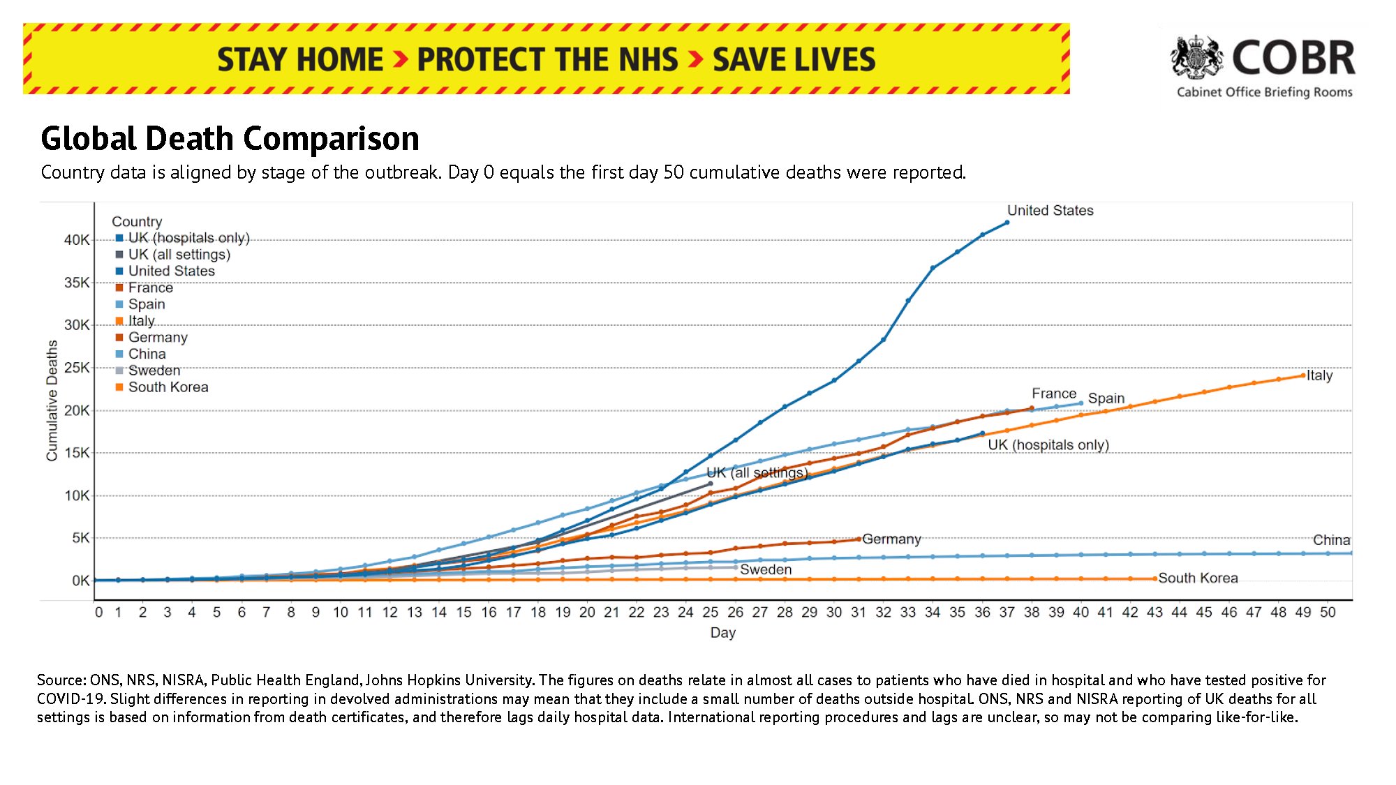
The chart is biased and seriously misleading because it shows only nine countries - it includes all four countries with a worse trajectory than the UK, but only a fraction of those with a better one.
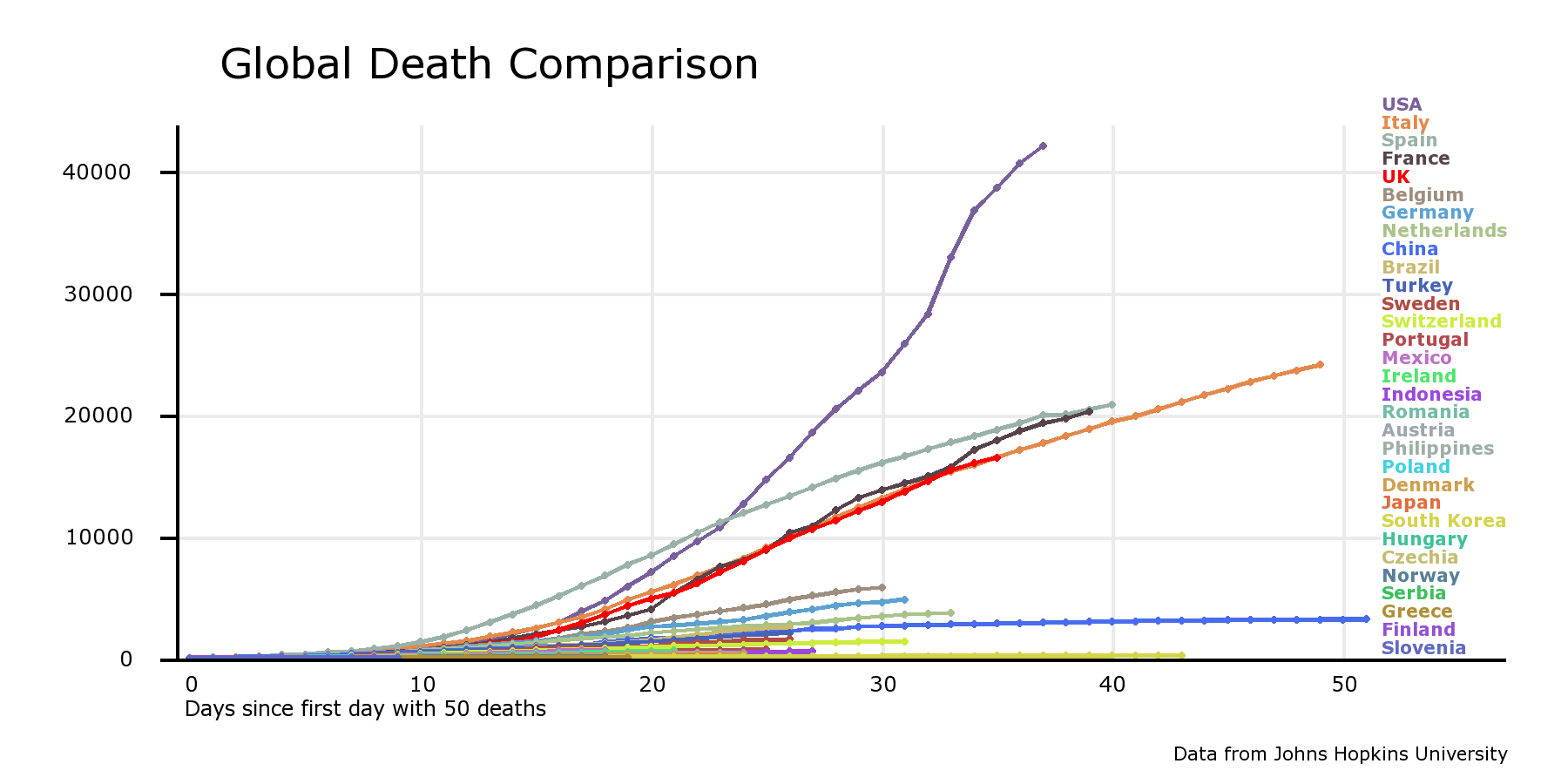
This second chart replicates the UK government one but with the addition of another 22 countries - all did better than the UK
These other countries have lines so close to the x axis that it's better to show them on a logarithmic scale, as in the third chart. Then it is clear that the UK has performed poorly, that change is needed in the way decisions are made, and that a new covid-19 action plan is needed.
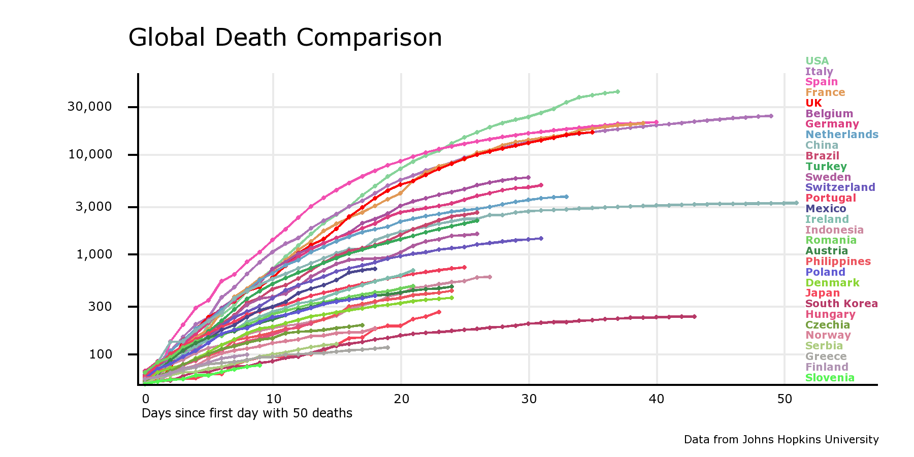
The bottom two charts were generated by the online chart-drawing facility at https://www.iancampbell.co.uk/covid-19.php. Up-to-date charts can be obtained from there.
First published: 21 Apr 2020
Last updated: 22 Apr 2020