Summary The toll of deaths and other consequences Deaths per day New cases per day UK "Global Death Comparison" chart UK nation and regional comparisons Poor UK Government decision making NHS/PHE labs are being denied testing reagents Unspecified case location in 70% of UK cases Problems with the covid-19 science Problems with the media and covid-19 Reasons to be concerned Reporting delays in Liverpool for covid-19 tests Action needed Elimination of the virus ("Zero covid") Elimination successes Population ("herd") immunity Countries with the best covid-19 control: half-lives of 5 days When to end the UK lockdown Predicting epidemics - Q and A R values, doubling times and halving times Data sources Data sources for covid-19.php Seven principles of public life in the UK Myths and misinformation About
UK "Global Death Comparison" chart
The UK Government published a "Global Death Comparison" chart at its daily press conference for more than one month until the last one (shown below) on Saturday 9 May 2020.
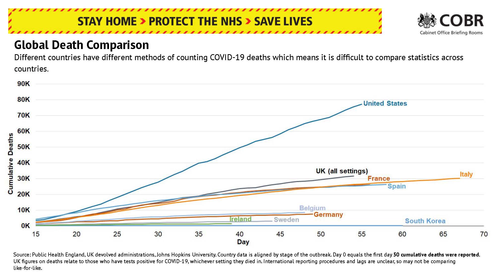
The charts on this page are replacements for that chart, but showing more countries:
1. a comparison of total deaths (similar to the UK Government chart)
2. a comparison of total deaths using a logarithmic* scale (*see below)
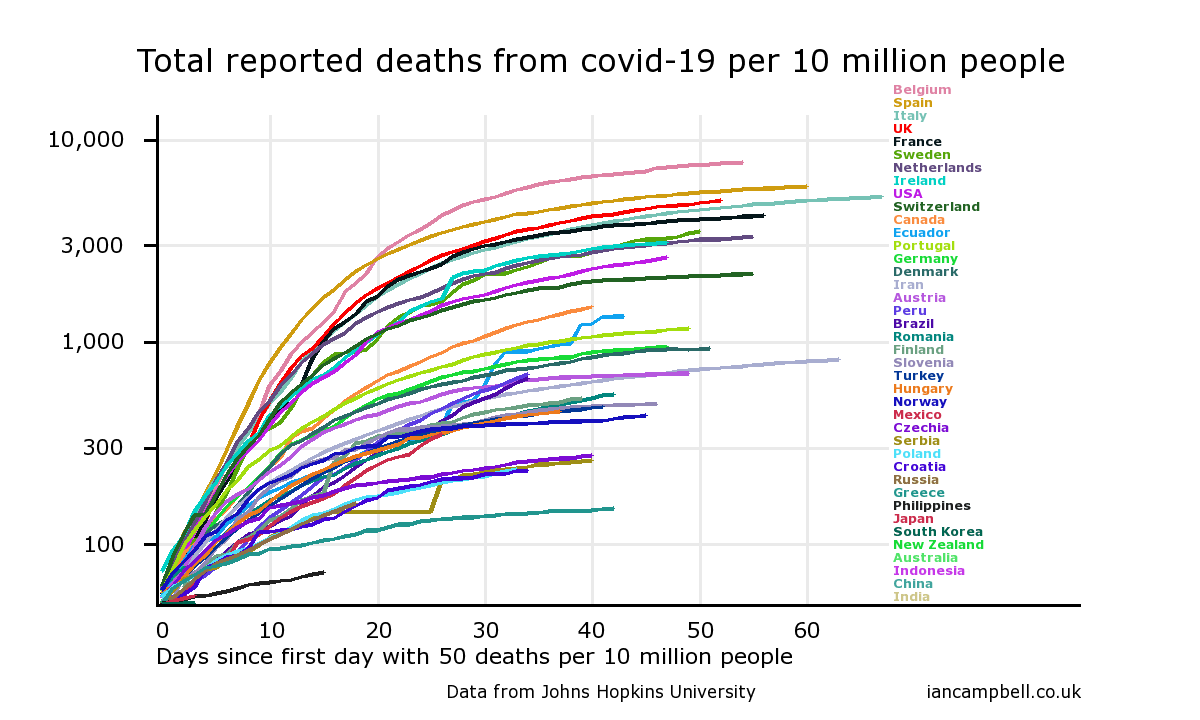
3. a comparison of total deaths per 10 million population
4. a comparison of total deaths per 10 million population using a logarithmic scale
1. Total deaths
The UK is the second worst in the world: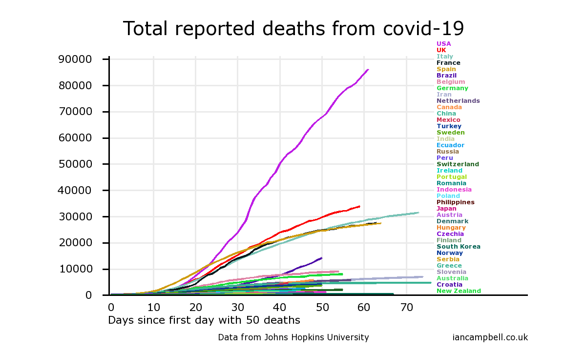
2. Total deaths (logarithmic scale)
This is the same data but using a logarithmic scale for deaths. The logarithmic scale means that higher values are compressed and smaller values are stretched out so that it is easier to see the differences between the smaller values. It shows that many countries have done a lot better than the UK in controlling their covid-19 outbreak.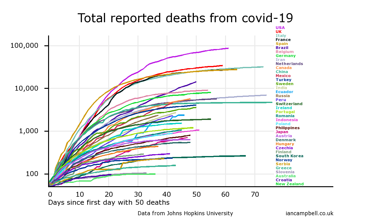
3. Total deaths per 10 million population
It is often said that countries with larger populations are likely to have larger epidemics, and so a more informative comparison is deaths per 10 million population. The UK is currently fourth worst on this measure, but looks likely to overtake Italy in time.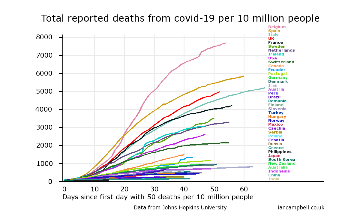
4. Total deaths per 10 million population (logarithmic scale)
Comment
On either of these measures, the UK has not managed its covid-19 outbreak well, and change is needed.The charts were generated by the online chart-drawing facility at https://www.iancampbell.co.uk/covid-19.php. Up-to-date charts can be obtained from there. All charts there and on these web pages can be freely copied and disseminated.
The data is from the Johns Hopkins Hospital database - see Data sources.
First published: 23 Mar 2020
Last updated: 15 May 2020
Summary The toll of deaths and other consequences Deaths per day New cases per day UK "Global Death Comparison" chart UK nation and regional comparisons Poor UK Government decision making NHS/PHE labs are being denied testing reagents Unspecified case location in 70% of UK cases Problems with the covid-19 science Problems with the media and covid-19 Reasons to be concerned Reporting delays in Liverpool for covid-19 tests Action needed Elimination of the virus ("Zero covid") Elimination successes Population ("herd") immunity Countries with the best covid-19 control: half-lives of 5 days When to end the UK lockdown Predicting epidemics - Q and A R values, doubling times and halving times Data sources Data sources for covid-19.php Seven principles of public life in the UK Myths and misinformation About